Wellness doesn’t have to be so LIVE LAUGH LOVE 👽🛸, you know?
Especially for a brand called Earthbar. Founded as a quirky vitamin shop in 1971, they were ready to refresh it all in 2021 — from positioning to packaging. But! Without walking away from their West Hollywood roots.

What we made
Brand Positioning | Product Curation Standards | Product Re-categorization | Visual and Verbal Identity | Key Messaging | Packaging | Dotcom | Naming
We 💚
Designer: Danny Solomon | Designer: Brandon Murray | Illustration: Rachel Topf | Photography: Wunderkind | all at Herman Scheer

New Product Category Naming + Classification that spans prepared foods, smoothies, supplements and shots 🌎 ESSENTIAL | BODY | GUT | MIND | LOOK

Fresh-pressed realness inside. We’re JUICY baby.

Naming: Cold Kicker - Packed with Oregano & aged garlic for natural anti-microbial power, plus ginger as a powerful anti-inflammatory, this shot is straight up firepower.

Oh,and these gorgeous shots bringing the energy?
Wunderkind.
The quintessential
California brand.

Naming: Rainbow Roots and First Aid | Evocative of flavor [Beets, and orange-aid, respectively] + sunny positivity ☀️ Rainbow Roots Illustration: Valery Lemay

🍊 An example of how my long form branding manifestos can be cut down into snackable lil’ tidbits 🍊

Packing your daily bowl since 1971. An IYKYK California-friendly copy moment 🌿
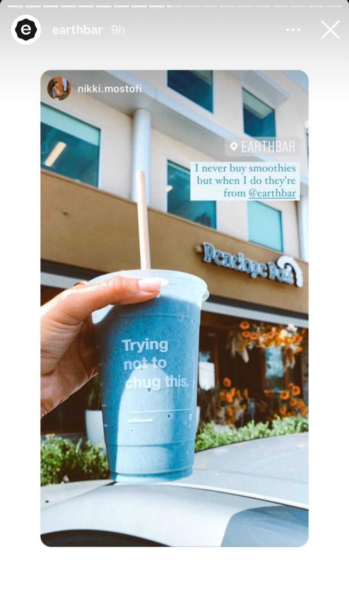
Packaging: Trying not to chug this. | Anticipation + Appetite Appeal 💙

Juice shops should be like sneaker and art drops. [Connected Brick + Mortar & Ecomm experience concept by me.]


In the mood…for more bev and food? 🍆
Check out 🍺 Molson Coors and 🍇 Wellory.

Naming: Celery Sunrise | You know that LA morning light ✨ what a way to start the day. | Illustrator: Valery Lemay

Naming: Endless Summer | That Venice Beach feeling, now in a bottle.

Naming: D-Tox | Like magic 🧚.